As I’m writing this, we here at New Why are in the middle of redesigning our own website and rolling out a new logo (!!). We have a severe case of “the cobbler’s kids have no shoes” – we’ve been back-burnering this for a a couple of years because we’ve been so busy building sites for all sorts of great local nonprofits and booming businesses, but it’s finally OUR TURN and we couldn’t be more excited.
One of the questions that came up in our discussions was whether or not to include a sidebar on our blog. This question also comes up in pretty much every web build we do. Usually, clients don’t have a solid idea of if they should or shouldn’t, and we talk through pros and cons.
I’ve had that conversation so many times, I thought I’d memorialize it/commit it to writing, in part so that I can check my thinking on it from time to time. So, without any further ado – here’s our current thinking on sidebars. Or mine, anyway!
What’s a sidebar?
The sidebar in a blog is that chunk of real estate to the left or right (sometimes both!) of the main content of a single blog post (and sometimes is also included in the blog index view as well – that’s your blog homepage where all of your recent posts show up). In the early years of blogging, these were often jam packed with lengthy lists of archives, categories, ads, random info. People just shoved a ton of stuff in there! See this screengrab of a blog from 2008.
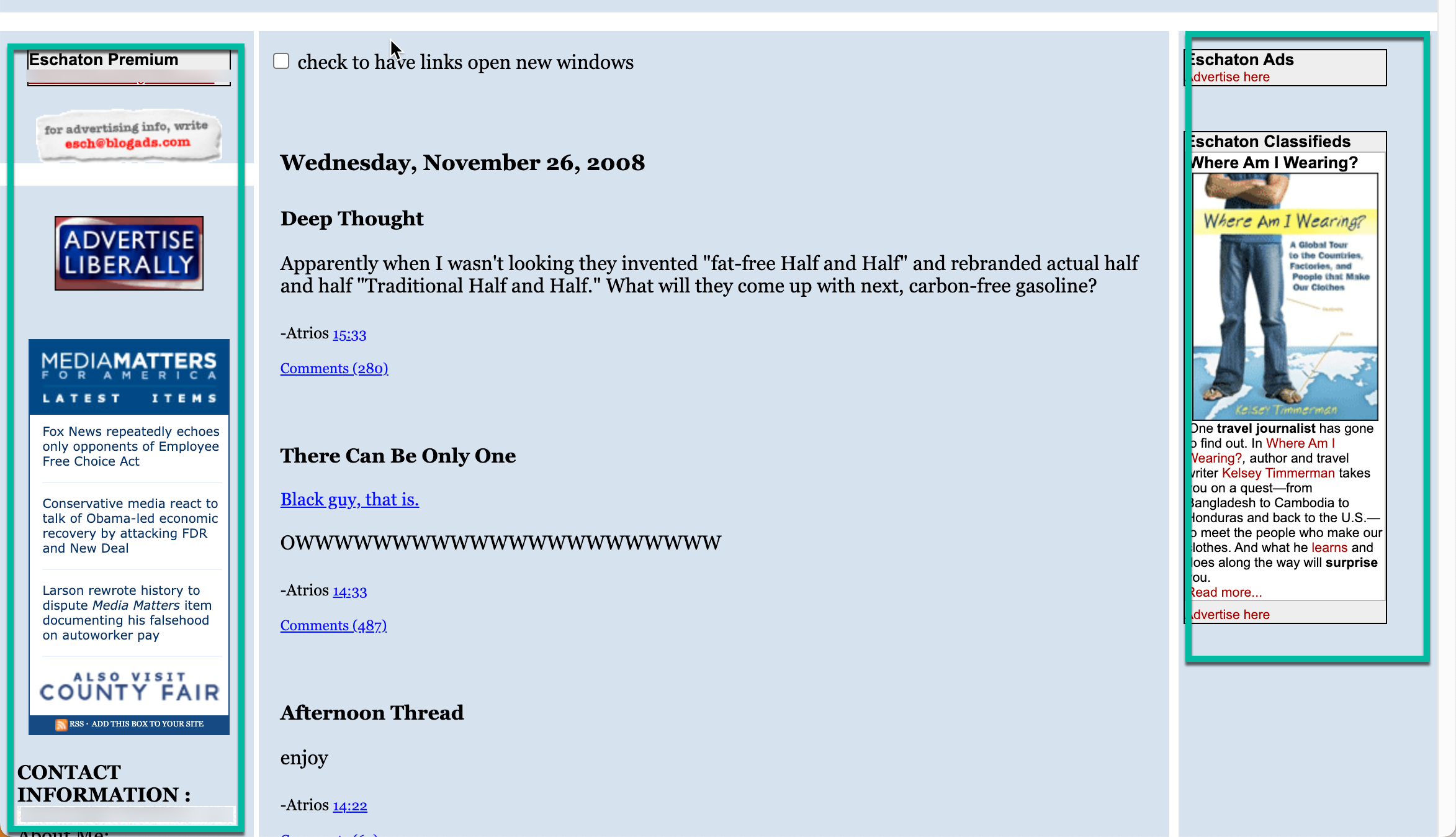
All sorts of things to distract you from the main content!
LOTs and lots of stuff – and the sidebar on the left just keeps on going.
As the web has matured (haha it’s really still a baby in the grand scheme of things, but we’re talking web-time, not geologic time today), we’ve realized that too many things to do on a page distract our visitors from the thing they came to do. None of us like things popping up, blinking at us, and filling our eyeballs with auxiliary info. We want focus, and our eyes require whitespace and rest in order to grok what we’re being served up on a website.
And so, in recent years, a trend has emerged where a lot of blogs (ours included) don’t have a sidebar at all.
Why would you use a sidebar?
If done well, sidebars can be pretty helpful! Some goals of a good sidebar might be:
- To encourage exploration and discovery of other related content on your site
- To capture leads, emails, prospective donors
- Or to encourage some kind of engagement.
 In the exploration vein, good sidebar content might contain other popular posts or top site pages, your most recent posts, posts that are related to the post being shown, top categories, upcoming events if you sponsor events. Stuff like that. The point is to say to your visitor “Hey, if you like this content, you’re gonna LOVE all this other content. Check it out.”
It keeps your blog post from being a dead end in their visit to your site. (Remember blogs can account for a lot of your website’s new visitors – a lot of them may not have seen your amazing and strategically constructed homepage.)
In terms of lead capture, options for your sidebar might be a newsletter signup, a primo/new piece of gated content (that’s content that users have to give you their email to access – maybe a whitepaper, ebook, canned webinars), or if you’re a nonprofit, a donation button.
The point here is to convert what might be a casual site visitor to someone who’s on your email list (you ARE building your list, right? AND you’re working on building it? This is especially important for nonprofits, but that’s probably a topic for another post.), or, to give a visitor an opportunity to make a donation at the very moment they’re engaged with your content (that is, the blog post itself).
If your blog gets a lot of traffic (you ARE monitoring your traffic, right?), that means a lot of eyeballs on these big calls to action, and you can design it in such a way that these conversion opportunities are available “above the fold,” as we old folks say.
And for other kinds of engagement, the most common thing here would be things like social sharing icons (like the ones you see floating to the left if you’re reading this on our 2017-2023 website, pre-rebuild), or links to upcoming events where folks can engage with you/your organization in a different way.
Sounds great, right?
Why wouldn’t you use a sidebar?
The real problem is that humans, turns out, have a really small (and continually diminishing thanks to Twitter/X/our phones, etc) attention span (but yay! You’re still here!). But seriously – if you want someone to READ and really get into your blog post, a sidebar can have some drawbacks.
- They can be cluttered/distracting
- And then there’s the mobile problem…
On the distraction front – while you can design sidebars to look great, a ton of extra content in front of a user when you want them focused on consuming your content can just lead them away from it – maybe even before you’ve really made your point/shared the story you want to share. Allowing your content to shine might require you to skip the sidebar.
And the mobile problem is really one of real estate. On a phone, in order for your blog post to be readable, it needs to take up the full width of the screen. That means that the sidebar gets smooshed down below your post, and almost nobody is going to see it there.
I suspect it’s the growing percentage of folks visiting sites on their phones that have led to sidebars falling out of favor. Something like 50% of users to your site are likely on their phone, so why bother building something half your visitors won’t see?
What to do? It depends.
Helpful, huh? But seriously. It DOES ddepend. On your site’s specific goals, your users’ needs, the amount of content on your site and in your blog.
SO if you do…
If you decide to include a sidebar, make sure that it is well-designed and organized, and that it doesn’t distract from your main content. If your blog is really content-heavy, you might lean toward doing that.
Make sure that you’re achieving the goals above (discovery, lead capture, engagement) while minimizing the clutter/distractions. You can also ask your web developer to just hide your sidebar on mobile devices/small screens. Not a bad way to split the difference!
AND if you don’t…
If you choose not to include sidebar, make sure you offer some place for your users to go from your post. That might be a pager at the bottom off your post that allows them to navigate to other recent posts, category links in your single post design (see the screeny below!), or links throughout your post to other posts on your site that a reader of THIS post might be interested in. It could be social engagement links (Share This on Twitter/X), a form at the bottom, or even, for the brave of heart, opening up comments on your post.

Lots of places for new visitors to go to find related content – without a sidebar!
Make a decision, and continue to question it
Like so much in web design, this decision should be made deliberately, with intention, and regularly revisited. Check your assumptions, check your data. If you start with a sidebar, use heatmapping or Analytics to see if it’s doing you any good. If it’s not, do some tests and see if you can get it to get any more traction. And if you can’t get that to budge, think about getting rid of it and see if that impacts how much folks engage with your blog.
If you start without one, check your data to see what happens when people land on your blog as their first contact with your organization. Do they stick around? If so, by what mechanism? Do they all bounce away?
Continuous improvement is the name of the game! Happily, your website isn’t carved in stone, but in infinitely malleable bits and bytes. Take advantage of that by always working to make it better!
Not sure HOW to make it better? Reach out to our web team to learn about New Why’s Conversion Rate Optimization services.
Have something to say?